A piece with a lot of screenshots about the close tab behaviour in Google Chrome
Ah, tabs.
Tabs, tabs, tabs. The specialist subject of UI experts everywhere. Should tabs just rearrange horizontally or also detach? How much vertical scroll buffer should a tab have before it detaches? Under what circumstances should it detach? What about reattaching?
This is a short piece concerned only with the different behaviours when closing tabs in Google Chrome, as I think these behaviours are fantastically thought through.
Closing tabs: a masterclass by Google Chrome
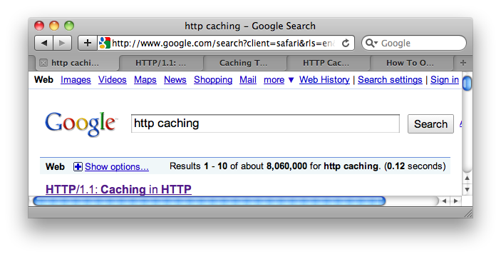
Let’s start by looking at some tabs in Safari (which was once what Chrome is before Chrome was).
If you add a number of tabs over the course of a session you will get something like this:
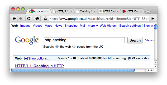
And in Chrome you will get this:
Closing tabs from the right
The first difference to notice is that Safari puts the ‘close tab’ control on the left of the tab, while Chrome has it on the right.
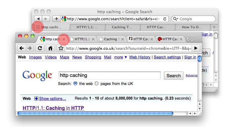
So what? Let’s close a tab from the end of the row and see what happens. Here’s a before and after in Safari:
And in Chrome:
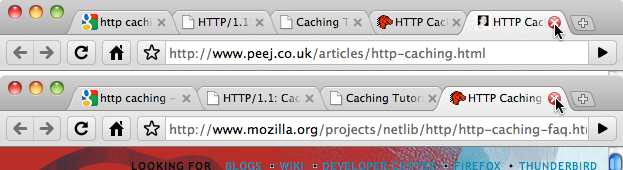
What’s the difference here? Well, both browsers have resized their tabs to fill the newly-freed window space, but due to the placement of the close button on Chrome, the mouse pointer is immediately in position to close the next tab:
While Safari is not.
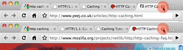
See how the close-button target moves when closing a couple of tabs in Safari:

There are no such problems in Chrome:
The Safari user has to hunt for the next close button each time, while the Chrome user can click the mouse button as many times as required in succession, with no movement of the mouse. Aha! It starts to make sense.
Closing tabs from the left
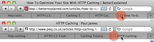
Or does it? This advantage is surely to be reversed when closing tabs from the left of the window? Quite right. Here is how the mouse pointer is required to move in Safari when closing a number of tabs at one time from the left:

Nice work, Safari. Let’s watch Chrome screw this up:
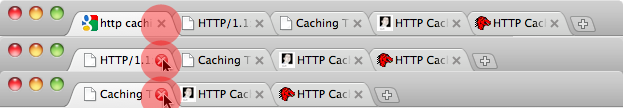
Egads! It worked!
What has happened here? Well, while Safari resizes the width of the remaining tabs to fill the newly available space each time a tab is closed – Chrome does not. So when a tab is closed from the left in Chrome, no resizing takes place, the rest of the tabs move along one, lining up the next close button directly under the mouse pointer, ready for the next click.
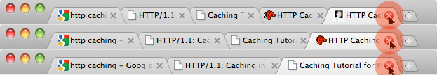
Now, Chrome will resize the tabs to fit the remaining space, but only after the mouse has left the functional area at the top of the browser; that is, after the user has finished interacting with the tabs and has moved their attention elsewhere. Here it is, before and after:
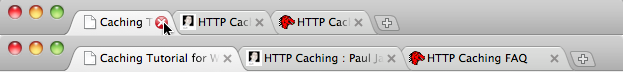
When the mouse moves from the toolbar area, the tabs resize.
Closing tabs from the middle of a group of tabs has exactly the same effect as above in Chrome – the tabs do not resize on close, only when the mouse pointer has left the toolbar. Safari immediately resizes the tabs. This means that closing tabs from the middle requires the user to hunt for each close button in Safari, while in Chrome, the buttons are lined up for the next click.
A couple of notes, conclusion
-
Note that if tabs are closed by use of a keyboard shortcut in Chrome, this ‘delayed resizing’ (i.e. remaining tabs not filling the newly freed space after a tab has been closed) does not happen – the tabs resize immediately, just as they do in Safari. This is, therefore, a very clearly considered assist for those using the mouse.
-
This resizing trait, although nuanced, is almost invisible to the user. In fact, it was completely invisible to me, for weeks, even though I was benefiting from this behaviour every day. It just worked correctly, in all cases – whether closing tabs from the left, right, or middle.
-
My conclusion is probably this: when a system’s UI is designed in such a way that its behaviours start to disappear – that’s what I call ‘the invisible’.
Endnote: Why is the close button on the right?
Here’s a point: the ‘delayed resizing’ behaviour in Chrome that has been described above means that placing the close button either on the left or right of the tab would have produced the same effect – the ability to close a number of tabs without horizontal movement of the mouse pointer. So why have Google chosen to place the close buttons on the right? I don’t think it’s just to annoy John Gruber.
In this case, I think Google were governed by this thought: by default, an application should exhibit the least-funky behaviour. Although the delayed resizing trick is subtle, natural, and almost completely invisible (as long as the user isn’t actively considering the nature of the tabs themselves), it is still less normal than if the application did not exhibit that behaviour at all.
In placing the close button on the right, Google have assumed that in the majority of cases, users are going to be wanting to close the most recently opened tabs first (likely to be the ones to the far right of the tab group) and have accordingly placed the close button on the right. Why? Because not only does this give the user the ability to close a number of tabs in one go without moving the mouse pointer (which Safari does not), it also means that the app does not need to exhibit the ever-so-slightly less normal behaviour of the ‘delayed resizing’ in the most-common case.
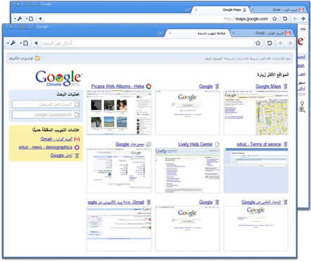
One final point. Tabs open left-to-right because we read left-to-right. If all of the above really was considered by some genial, tab-obsessed Google employee, you would expect a right-to-left language version of the browser to not only open tabs the other way around, but to also put the close button on the left.
Here’s Google Chrome in Arabic:
I suppose Gruber could just use that.